Grade 3: Data Management Study Guide
Test Date: Jan 29 2016 (Friday)
Students should have an understanding of the following concepts:
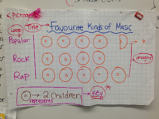
- Read data which has been organized in different ways (i.e. pictographs, bar graphs, tally charts, circle graph)
- Pose and answer questions regarding data (i.e. which choice is the most common? How many students were surveyed altogether?)
- Interpret results by comparing and using full sentences
(i.e. There are 2 less students who like the colour blue than the colour red. There are 4 more students whose favourite food is pizza than pasta.)
- Identify the mode (the value that shows up most often in a set of data)?
- Create a bar graph and a pictograph
- Choose an appropriate scale for a bar graph (i.e. if the data is: 5, 10, 30, 45, 23…the scale most appropriate to use would be counting by 5.)
*Remember:
* A pictograph has a key (showing the symbol), but a bar graph does not because it has a scale (the numbers on the side).
* A bar graph must have: a title, a labelled horizontal axis, a labelled vertical axis and an appropriate scale!
*Some important vocabulary that students can use to communicate their thinking:
More than, Less than, Most common/most popular, Altogether


